


Desk Notes is a new series of insights from our experience working actively with over 40 SaaS companies. You can find more of Allen's thoughts on tech through his Medium or on Twitter.
***
If you’re a SaaS founder who’s looking to raise a Series A or are post Series A, you probably have enough data points to track your SaaS metrics and use them to refine your decision making. One of the things we help our companies with is cohort analysis. Here are our desk notes to help you think through cohort analysis, why it's useful and some things to look out for.
Not all cohorts are made equal
At EVP we love analysing cohorts. Cohort analysis is essentially a way to tell how a select group of users are ‘behaving’ over a period of time. This behaviour becomes a proxy for us to understand the performance of a select group of users over time, and how that has translated to revenue and how 'sticky' a product is.
Here are a few of the things we consider when analysing cohorts…
- Time parameters. Cohort analysis almost always involves a time-bounded approach to grouping users. The most straightforward example is taking all users that joined on a particular month and grouping them together as one cohort. That cohort ages consistently so that you know at 6 months, 8 months and 12 months later the factors impacting that cohort are essentially the same. You can also group into quarterly or annual cohorts for simplicity and larger sample sizes.
- Performance metric. SaaS cohort analysis requires a metric to track, the most common being subscription revenue (Revenue Retention) or number of accounts (Logo Retention). Subscription revenue can be analysed on a gross or net basis which includes revenue increases from upgrades, cross-sells and increasing usage. Ultimately, the point of tracking these two is that they provide the strongest signal of product stickiness and fit. Other performance metrics can include stats like user engagement (logins, shares, usage) or unit economics (payback, LTV)… anything that can signal stickiness, fit or value created.
- Segment investigation. Your SaaS business might include multiple sub-products or feature sets bundled into one subscription with different use-cases depending on the target customer. There might also be multiple tiers of features or country specific content so it’s often interesting to isolate the behaviour of user groups by further segmentation. You want to consider how user groups might engage with the product differently and how certain features may or may not be available or applicable to these groups.

Presenting cohorts
[These notes assume an understanding of how to create cohort analysis]
Cohort analysis is typically presented in one of three ways shown below. These visualisations are useful in making sense of the data and eliciting patterns in the numbers. They're arguably the all-star visual communication tools for understanding business performance.
The trusted data table🪟
The most common way SaaS investors present cohorts for analysis is in a data table. Cohort data tables generally group on the Y axis by the month each cohort joined. Lifetime is displayed on the top X-axis, representing their first, second and so-on month with the product.

Performance metrics are shown through the body of the table and colour scales indicate good or bad. The size of each cohort is often referenced on the side (blue bar charts next to the date). Reading down the column helps assess improvement across cohorts over time and across a row shows retention within a cohort.

The layered cake 🍰
The layered cake is a stacked area chart normally used to show ARR over time. Layered cake charts are incredible for showing composition of revenue by cohort and the level of revenue expansion or contraction across the board. Ideally the layered cake shows each cohort is stacking and continually expanding such that overall ARR growth is exponential.
Layered cake also highlights the proportion each cohort is contributing to overall revenue at each point in time and the overall age of your revenue base.
— Mark Velik

The party streamer 🎉
The party streamer is a type of line chart used to display the time it takes for each cohort to hit a certain milestone. It’s a popular way to monitor performance in direct to consumer business where time to fully payback acquisition cost is typically tracked. The ideal party streamer chart shows increasingly steep lines as later cohorts reach profitability earlier (indicative of improving acquisition funnel or increasing basket sizes).

Dissecting cohort performance — tell me what the story is!
If you’re running a SaaS business you’ve probably come across a multitude of guides telling you what ‘good’ metrics look like.

While these benchmarks are helpful for making a quick assessment and generally accurate for pure subscription software, there are some nuances to look out for. Every cohort tells a story and stories are more interesting if we understand the context; which in the case of SaaS, is about the product, the market and the business model. Not all cohorts are made equal and here are some things to look out for.
The pricing model and the Month-0 problem
Pricing model changes. Be conscious of how pricing changes can impact the shape of revenue cohorts. One of our companies experimented with a three-month discounted price ramp to encourage new customers. As users transitioned from their discounted plans to full-paying plans we see overall revenue jump >200%, an exciting increase when seen in isolation. Zooming out we start to see these numbers trend back towards the pre Mar-20 cohorts. It’s often worthwhile normalising the effect of this price ramp to track the drop off from month 3 otherwise the numbers may be artificially inflated.

Time to value and the Month-0 problem. Outside of pricing impacts, it's often useful to start cohorts from a future data point (Month-2 or beyond) where revenue and usage is more stable. Particularly in models where usage tends to ramp up as customers experiment and adapt. For example, Hnry is a business finance and tax app for the self-employed that charges based on a percentage of income through the app. Starting from Month-0 will show an increasing attach rate as customers start to migrate their invoicing and payments collection and ramp-up to steadier levels of usage. Looking at cohorts without adjusting to the steady-state would conflate the effect of attach rate with long-term retention.

Subscription retention alone can be misleading…
One of our best performing investments has below average logo retention and <100% net retention on subscription revenue. One of the reasons we love SaaS is the ability to wedge into the market and extend value through other offerings like payments, marketplaces and services (David Yuan has a great article about this https://www.linkedin.com/pulse/frontier-extend-through-value-chain-david-yuan/). Here the users that stuck around were using the software to facilitate hundreds of payments a month and paying a small fee on every invoice they issued through the software. A large percentage of users churn but the value is sitting in the sticky customers who are running their entire businesses through the system.

Product-led and consumer facing
Some products are built for SMBs but end up attracting a stream of direct customers that are hobbyists, one-person shops or students. This is typically more pronounced in product-led models where the barrier to sign-up is very low. The price sensitivity is higher and time to churn can be much quicker as the product is used for one-off projects instead of ongoing business purposes.
As such, logo retention can be very deceiving as low value customers get churned off quickly. Net revenue retention can also look abnormally low unless you split out the target users from the general users. We’ve invested in companies with these kinds of cohorts and look to split out the high value segments and make sure that acquisition funnel is efficient enough to acquire those high value customers.
There might be a steep decline [with retention lines] at first but the fact it eventually flattens out shows there are a group of customers for which there is great fit with the product.
— Mark Velik
Variations across markets
One important reason to slice your cohorts by segments is that aggregate cohorts can mask problems. This exact phenomenon was surfaced during a follow-on raising by one of our companies. CAC payback (time it takes to recover the cost of acquiring a customer) across the company on aggregate was sitting at around ~16 months but looking cohorts split geographically showed that Australia took >24 months to recover.

This perspective helps inform how acquisition has performed. The more mature New Zealand business enjoyed the benefits of less competition and lower acquisition costs driven by wider brand recognition and better organic referrals. We‘ve also seen this effect a couple of times across the portfolio as companies start to seed new markets and CAC improves over time.
I think payback period is an underused metric. Lifetime value is so hard to model or think about, but payback period is kind of factual. I think the point of the cohort analysis is to show customer benefit from the product but also to dictate how hard a company might be willing to go on acquisition.
— Justin Lipman
Pay to play — keep in mind cost to serve
Not all cohorts are made equal and neither is revenue. Investors like to focus heavily on acquisition channels and like to think of revenue through a paid vs organic lens. Unfortunately, we also tend to get overexcited when talking about expansion revenue and throw the frameworks out the window, forgetting to acknowledge that upselling can require its own independent sales team and significant resources to generate each incremental dollar. A dollar of organic revenue expansion (through clever feature gating, product-led upgrades and naturally growing usage) is more valuable than a dollar of acquired upsell.
“I think it’s often missed that there might be large selling efforts to upsell or extend a customer contract, not really captured. So I think a distinction needs to be at least acknowledged by the analyser as to whether a customer is self-upgrading or being pushed. Obviously different value to the retention rates here.” — Justin Lipman
COVID impacted cohorts
It might seem obvious, but it’s really important to keep an eye out for COVID impact on cohorts. Fortunately, software has stayed quite resilient through the pandemic and there are plenty of products that benefitted from the accelerated adoption of technology (workplace SaaS, communications and e-commerce to name a few).
There are certainly software companies that felt the flow-on impact as their customers faced the crippling effect of lockdowns (travel, food and events). The cohort belows showed us that the cohorts that signed up prior to COVID (all are one year contracts) churned through their renewals as they came up during periods of high uncertainty and mass restrictions. The wave of new logos also decreases as we headed into and throughout 2020 / 2021.

Seasonality
Seasonality is when a time series dataset exhibits regular and predictable changes that recur over a time period. Any predictable pattern that recurs or oscillates over a one-year period is regarded as seasonal. Cohort data tables are surprisingly great for revealing seasonality trends. The patterns can reveal how a product is being used and can alleviate fears that a product is broken. The table below shows a small-business product where the revenue model is a percentage of payments collected. The clear red diagonal that tracks up from May-18 (Mth 9) to Dec-18 (Mth 2) helps reveal a story about usage behaviour, revenue dips through the December holiday period and bounces back as people get back to work.

Below we see seasonality incredibly clearly in Intuit’s 7 years of cohort numbers. Intuit is a global software company that specialises in financial software. The product revenues tracked below primarily include TurboTax (income tax returns product) and Quickbooks (SMB accounting and financial management software).
The seasonal effect for Intuit happens to occur around April which is not surprisingly tax return season. This pattern tells a story of usage behaviour in cohorts, who sign-up at the start of tax season to use TurboTax and switch it off until next year.
To wrap this up...
Hopefully you’ve taken away a more nuanced understanding of cohorts and can appreciate the stories that can be told. At EVP we monitor these metrics for every company we work with. Reach out to us if you want help understanding how your business is going and how you can improve performance.
Desk Notes is a new series of insights from our experience working actively with over 40 SaaS companies. You can find more of Allen's thoughts on tech through his Medium or on Twitter.
***
If you’re a SaaS founder who’s looking to raise a Series A or are post Series A, you probably have enough data points to track your SaaS metrics and use them to refine your decision making. One of the things we help our companies with is cohort analysis. Here are our desk notes to help you think through cohort analysis, why it's useful and some things to look out for.
Not all cohorts are made equal
At EVP we love analysing cohorts. Cohort analysis is essentially a way to tell how a select group of users are ‘behaving’ over a period of time. This behaviour becomes a proxy for us to understand the performance of a select group of users over time, and how that has translated to revenue and how 'sticky' a product is.
Here are a few of the things we consider when analysing cohorts…
- Time parameters. Cohort analysis almost always involves a time-bounded approach to grouping users. The most straightforward example is taking all users that joined on a particular month and grouping them together as one cohort. That cohort ages consistently so that you know at 6 months, 8 months and 12 months later the factors impacting that cohort are essentially the same. You can also group into quarterly or annual cohorts for simplicity and larger sample sizes.
- Performance metric. SaaS cohort analysis requires a metric to track, the most common being subscription revenue (Revenue Retention) or number of accounts (Logo Retention). Subscription revenue can be analysed on a gross or net basis which includes revenue increases from upgrades, cross-sells and increasing usage. Ultimately, the point of tracking these two is that they provide the strongest signal of product stickiness and fit. Other performance metrics can include stats like user engagement (logins, shares, usage) or unit economics (payback, LTV)… anything that can signal stickiness, fit or value created.
- Segment investigation. Your SaaS business might include multiple sub-products or feature sets bundled into one subscription with different use-cases depending on the target customer. There might also be multiple tiers of features or country specific content so it’s often interesting to isolate the behaviour of user groups by further segmentation. You want to consider how user groups might engage with the product differently and how certain features may or may not be available or applicable to these groups.
Presenting cohorts
[These notes assume an understanding of how to create cohort analysis]
Cohort analysis is typically presented in one of three ways shown below. These visualisations are useful in making sense of the data and eliciting patterns in the numbers. They're arguably the all-star visual communication tools for understanding business performance.
The trusted data table🪟
The most common way SaaS investors present cohorts for analysis is in a data table. Cohort data tables generally group on the Y axis by the month each cohort joined. Lifetime is displayed on the top X-axis, representing their first, second and so-on month with the product.
Performance metrics are shown through the body of the table and colour scales indicate good or bad. The size of each cohort is often referenced on the side (blue bar charts next to the date). Reading down the column helps assess improvement across cohorts over time and across a row shows retention within a cohort.
The layered cake 🍰
The layered cake is a stacked area chart normally used to show ARR over time. Layered cake charts are incredible for showing composition of revenue by cohort and the level of revenue expansion or contraction across the board. Ideally the layered cake shows each cohort is stacking and continually expanding such that overall ARR growth is exponential.
Layered cake also highlights the proportion each cohort is contributing to overall revenue at each point in time and the overall age of your revenue base.
— Mark Velik
The party streamer 🎉
The party streamer is a type of line chart used to display the time it takes for each cohort to hit a certain milestone. It’s a popular way to monitor performance in direct to consumer business where time to fully payback acquisition cost is typically tracked. The ideal party streamer chart shows increasingly steep lines as later cohorts reach profitability earlier (indicative of improving acquisition funnel or increasing basket sizes).
Dissecting cohort performance — tell me what the story is!
If you’re running a SaaS business you’ve probably come across a multitude of guides telling you what ‘good’ metrics look like.
While these benchmarks are helpful for making a quick assessment and generally accurate for pure subscription software, there are some nuances to look out for. Every cohort tells a story and stories are more interesting if we understand the context; which in the case of SaaS, is about the product, the market and the business model. Not all cohorts are made equal and here are some things to look out for.
The pricing model and the Month-0 problem
Pricing model changes. Be conscious of how pricing changes can impact the shape of revenue cohorts. One of our companies experimented with a three-month discounted price ramp to encourage new customers. As users transitioned from their discounted plans to full-paying plans we see overall revenue jump >200%, an exciting increase when seen in isolation. Zooming out we start to see these numbers trend back towards the pre Mar-20 cohorts. It’s often worthwhile normalising the effect of this price ramp to track the drop off from month 3 otherwise the numbers may be artificially inflated.
Time to value and the Month-0 problem. Outside of pricing impacts, it's often useful to start cohorts from a future data point (Month-2 or beyond) where revenue and usage is more stable. Particularly in models where usage tends to ramp up as customers experiment and adapt. For example, Hnry is a business finance and tax app for the self-employed that charges based on a percentage of income through the app. Starting from Month-0 will show an increasing attach rate as customers start to migrate their invoicing and payments collection and ramp-up to steadier levels of usage. Looking at cohorts without adjusting to the steady-state would conflate the effect of attach rate with long-term retention.
Subscription retention alone can be misleading…
One of our best performing investments has below average logo retention and <100% net retention on subscription revenue. One of the reasons we love SaaS is the ability to wedge into the market and extend value through other offerings like payments, marketplaces and services (David Yuan has a great article about this https://www.linkedin.com/pulse/frontier-extend-through-value-chain-david-yuan/). Here the users that stuck around were using the software to facilitate hundreds of payments a month and paying a small fee on every invoice they issued through the software. A large percentage of users churn but the value is sitting in the sticky customers who are running their entire businesses through the system.
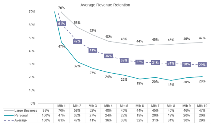
Product-led and consumer facing
Some products are built for SMBs but end up attracting a stream of direct customers that are hobbyists, one-person shops or students. This is typically more pronounced in product-led models where the barrier to sign-up is very low. The price sensitivity is higher and time to churn can be much quicker as the product is used for one-off projects instead of ongoing business purposes.
As such, logo retention can be very deceiving as low value customers get churned off quickly. Net revenue retention can also look abnormally low unless you split out the target users from the general users. We’ve invested in companies with these kinds of cohorts and look to split out the high value segments and make sure that acquisition funnel is efficient enough to acquire those high value customers.
There might be a steep decline [with retention lines] at first but the fact it eventually flattens out shows there are a group of customers for which there is great fit with the product.
— Mark Velik
Variations across markets
One important reason to slice your cohorts by segments is that aggregate cohorts can mask problems. This exact phenomenon was surfaced during a follow-on raising by one of our companies. CAC payback (time it takes to recover the cost of acquiring a customer) across the company on aggregate was sitting at around ~16 months but looking cohorts split geographically showed that Australia took >24 months to recover.
This perspective helps inform how acquisition has performed. The more mature New Zealand business enjoyed the benefits of less competition and lower acquisition costs driven by wider brand recognition and better organic referrals. We‘ve also seen this effect a couple of times across the portfolio as companies start to seed new markets and CAC improves over time.
I think payback period is an underused metric. Lifetime value is so hard to model or think about, but payback period is kind of factual. I think the point of the cohort analysis is to show customer benefit from the product but also to dictate how hard a company might be willing to go on acquisition.
— Justin Lipman
Pay to play — keep in mind cost to serve
Not all cohorts are made equal and neither is revenue. Investors like to focus heavily on acquisition channels and like to think of revenue through a paid vs organic lens. Unfortunately, we also tend to get overexcited when talking about expansion revenue and throw the frameworks out the window, forgetting to acknowledge that upselling can require its own independent sales team and significant resources to generate each incremental dollar. A dollar of organic revenue expansion (through clever feature gating, product-led upgrades and naturally growing usage) is more valuable than a dollar of acquired upsell.
“I think it’s often missed that there might be large selling efforts to upsell or extend a customer contract, not really captured. So I think a distinction needs to be at least acknowledged by the analyser as to whether a customer is self-upgrading or being pushed. Obviously different value to the retention rates here.” — Justin Lipman
COVID impacted cohorts
It might seem obvious, but it’s really important to keep an eye out for COVID impact on cohorts. Fortunately, software has stayed quite resilient through the pandemic and there are plenty of products that benefitted from the accelerated adoption of technology (workplace SaaS, communications and e-commerce to name a few).
There are certainly software companies that felt the flow-on impact as their customers faced the crippling effect of lockdowns (travel, food and events). The cohort belows showed us that the cohorts that signed up prior to COVID (all are one year contracts) churned through their renewals as they came up during periods of high uncertainty and mass restrictions. The wave of new logos also decreases as we headed into and throughout 2020 / 2021.
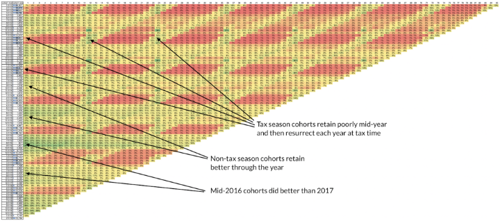
Seasonality
Seasonality is when a time series dataset exhibits regular and predictable changes that recur over a time period. Any predictable pattern that recurs or oscillates over a one-year period is regarded as seasonal. Cohort data tables are surprisingly great for revealing seasonality trends. The patterns can reveal how a product is being used and can alleviate fears that a product is broken. The table below shows a small-business product where the revenue model is a percentage of payments collected. The clear red diagonal that tracks up from May-18 (Mth 9) to Dec-18 (Mth 2) helps reveal a story about usage behaviour, revenue dips through the December holiday period and bounces back as people get back to work.
Below we see seasonality incredibly clearly in Intuit’s 7 years of cohort numbers. Intuit is a global software company that specialises in financial software. The product revenues tracked below primarily include TurboTax (income tax returns product) and Quickbooks (SMB accounting and financial management software).
The seasonal effect for Intuit happens to occur around April which is not surprisingly tax return season. This pattern tells a story of usage behaviour in cohorts, who sign-up at the start of tax season to use TurboTax and switch it off until next year.
To wrap this up...
Hopefully you’ve taken away a more nuanced understanding of cohorts and can appreciate the stories that can be told. At EVP we monitor these metrics for every company we work with. Reach out to us if you want help understanding how your business is going and how you can improve performance.